Steam Mobile App Redesign
A UX case study on my redesign of the Steam mobile app experience.

What is Steam?
Steam is the leading digital distribution platform developed by Valve Corporation for purchasing and playing video games on the PC. It offers the largest library of games with over 30,000 games and boasts over 90 million monthly users in early 2019. This platform has been growing for over 15 years since its release in 2003 and contains a myriad of extra features.
Platforms
Adobe XD, Illustrator, Photoshop
Problem
As an avid PC gamer, I have hundreds of games on Steam and always try to keep up to date with new releases. With such a huge user base, the mobile app is missing out on so much potential in creating a better shopping experience, engaging with users and supporting their community. The Steam mobile app debuted in 2012. It not received any visual style updates since 2013 and its last update at time of writing was over 2 years ago. It sits at a rating of 2.6 out of 5 with over 4150 ratings. The app not only looks dated, it’s clunky and inefficient to navigate. With competitors like Origin, Epic Games, Discord launching their own hubs for digital game distribution, Steam should bolster its weaknesses to maintain their competitive advantage.
Solution
My goal for this redesign is to address the user interface and visual identity of the app, allowing for better navigation and clarity. My intention is not to create an entirely different visual style, but modifying it enough to feel modern yet having a similar enough feel that users will have an easy transition from the desktop app across various platforms.

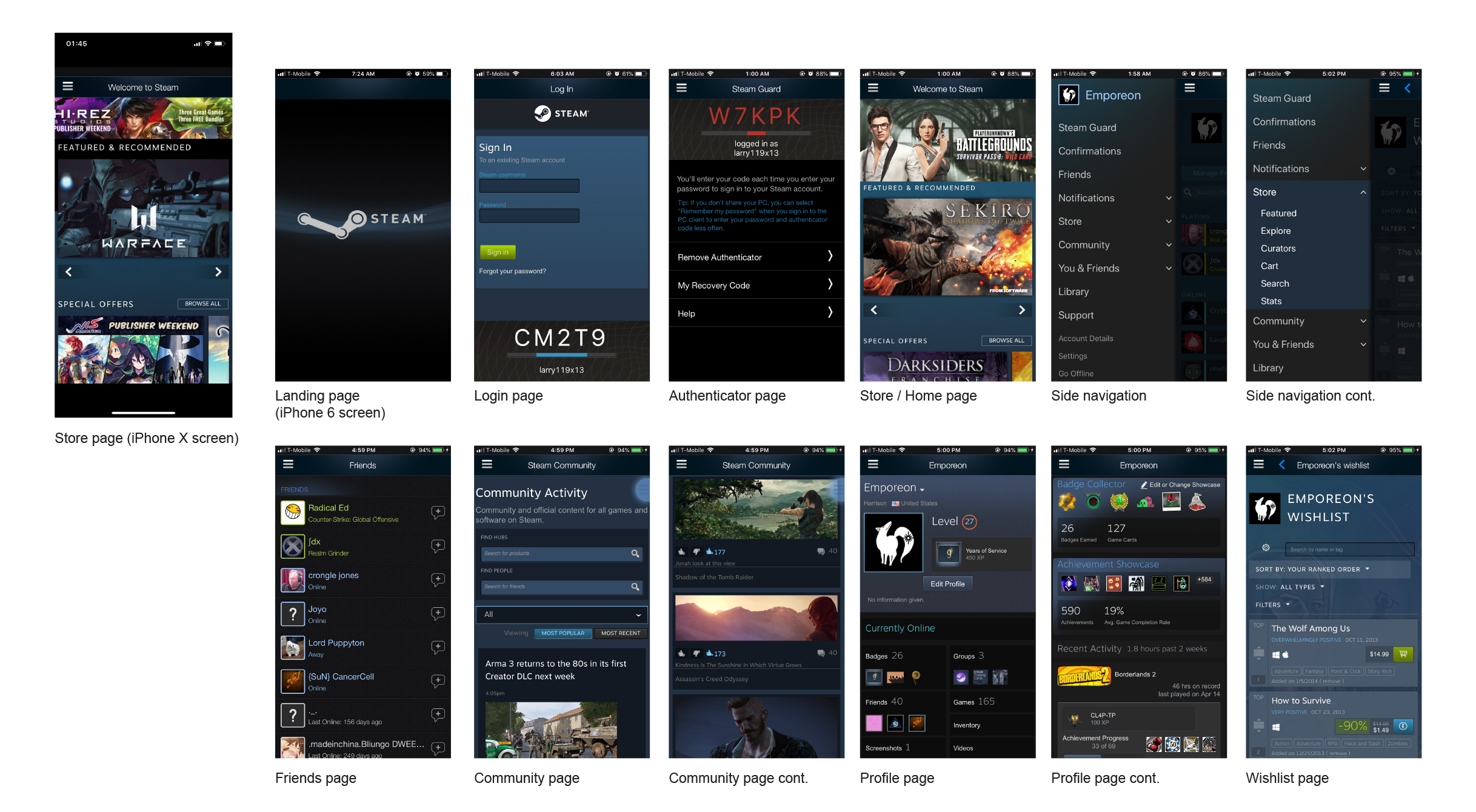
Current Steam Mobile App

Pain Points
From reading user reviews and comparing the design to modern apps, I gathered a list of common issues:
The interface design is outdated (It even had black bars on the newer, larger phone screens!)
App was inefficient to navigate
Poor information hierarchy
Lack of modern navigation functions like page swiping
Technical issues and bugs
Then I looked at when and why people use the Steam Mobile app.
Users & Audience
To get Steam Guard Code for logging into the computer (Multi-Factor Authentification)
Check for sales
Buy and sell Steam Trading Cards
Authenticate market purchases and sales
Message Steam friends
In addition to these reviews, I’ve also conducted research on friends and classmates who have experience with the Steam mobile app so see what their pain points and uses were.

Current Navigation
The main navigation for the current app has everything inside the side menu, which is accessible only when you tap the hamburger icon on the top left. Lots of hidden menus and lack of gesture support like swipe for pages make for inefficient navigation. The menu also takes away 75% of your screen space as well as blocking your view from the page you were on. This all in one menu also forces the user to make one extra tap before they can select the page they want to go to. To address the menu, I think splitting this side navigation into a more modern top and bottom navigation as well as grouping similar pages would allow for more efficient navigation.
Wireframes
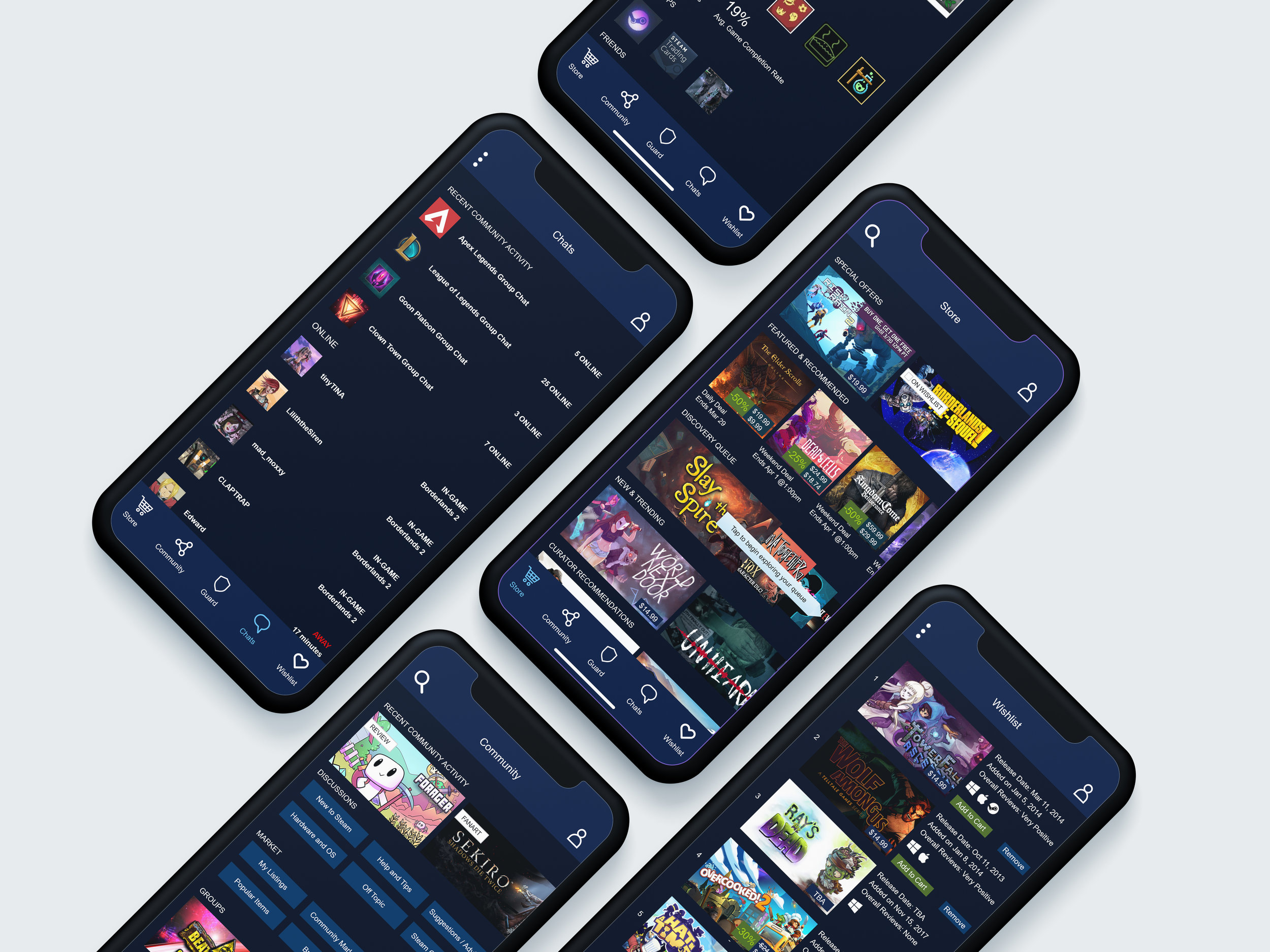
I wanted to get rid of the “blocky” webapp format which Steam uses to arrange sections of a page. Getting rid of these square backgrounds will give the app a more modern feel. Instead I use bold and capital text to create information hierarchy and section out pages. Certain pages like the Wishlist page are also too text heavy, so giving it more images will alleviate extra brain processing when scrolling. With navigation, I took the five most used and visited pages and placed them on the bottom navigation, allowing easier access and easier switching with one tap. The Steam Guard page will be the landing page when you login as most users will use this for their multi-factor authentication when logging into their desktop app. The profile button is also on the top right, making a total of 6 easily accessible pages. The top left button will vary depending on the page. Since most pages have a search function, it will usually function as a search, but for pages like Profile, or other pages where a search function is not needed, it can serve as a settings or options button.
Mock Ups
The color palette of the Steam apps on Desktop and consoles include dark colors such as black and gray, juxtaposed with white text and other accents such as light green and light blue. The darker theme is synonymous with gamers so I wanted to keep that style in the redesign. The mobile app had not received any of the visual updates that the desktop app had and the colors did not contrast as well. For that reason, I turn the grays and blues darker to contrast better with the light colors. I also incorporated the subtle use of gradients in the background. Rather than having multiple colored blocks on a page that separated the page, I kept the background one color and used text for sectioning off a page.
Comparison
Awards
Featured on: Design Rush