
Gig
Gig is an app that allows Brooklyn’s music lovers to find small live music shows, of any genre, within the borders of Brooklyn for tonight, tomorrow, or the next day.
Concept Background
In my Interactive Devices course, our group decided to design an hyperlocal app for local band-goers and local bands centered around Brooklyn.
Platforms
Adobe XD, Photoshop,
Indesign, Illustrator
Team
Harrison Liang
Sophia Trepp
Patricia Hill
Role
Mainly contributed in UI, user research, user testing, information architecture, paper prototying and interactive prototyping. I also participated in the ideation process, the style guide, and the flow chart.
Process
In order to see where Gig fits into the music finding market, we first identified our strategic value proposition, then we identified and researched our target user base, our competitors and existing applications with comparable features. Before prototyping, we created storyboards and tested the functionality of low fidelity mock ups. Taking those results, we adjusted the design and functionality before we created mid fidelity mock ups. Finally, we compared and contrasted our potential with our competitors to highlight Gig’s potential and where we may need to improve as well as adding value added services to incentivize users to use our app.
User Personas
Two of our primary users include someone seeking to use our app to find a gig to attend, and a band member who will use our app to promote their gig. With their wants and needs in mind, we looked to create functions and features that they would want and need.
Competitive and Comparative Analysis of Existing Competitors
Three of our competitors are Bandsintown, Songkick, and Gigtown. All three of these services connect users to upcoming music events in their local vicinity.
Three of our comparative companies are Atom, Cups, and Eventbrite. These services are similar in that they help you search and discover upcoming events and allow you to buy tickets to attend them.
We analyzed these services and how they operate. By looking at their features, content, social media presence, and more, we can determine their competitive advantages. For example, Bandsintown’s competitive advantage is that it uses Facebook and other social media to allow you to track your favorite artists. Songkick has a strong local market in London and a majority of its ticket sales are based around London. Identifying these advantages allow us to be more aware of how we have to build our app to stand out against the competitive as well provide similar services which have already proven to be successful.
Paper Prototype Usability Test
Based on our value proposition, user research, competitive and comparative research, we designed a storyboard to create a guessable app which allows our users to find live nearby gigs, offered at all times, in Brooklyn seamlessly and quickly. Some key takeaways were how we designed the sign up process and the various pages on our app. We postponed the sign up page to the end of the sign up process because we thought users would be more likely to sign up after they have filled out a few “get to know me” pages. Amongst our classmates, the majority agreed that they have had better experiences with this type of sign up process, rather than being asked to sign up before adjusting your preferences. Giving the users the option of signing up with their Google, Twitter, or Facebook accounts also shorten the barrier of entry for users who don’t want to create a new account. Our friends Leslie Koo, Amy Ganz, and Patrick Warren helped test our usability by trying to navigate through our app as they fulfill a list of tasks we provided for them.


Style Guide and Splash Screen Designs
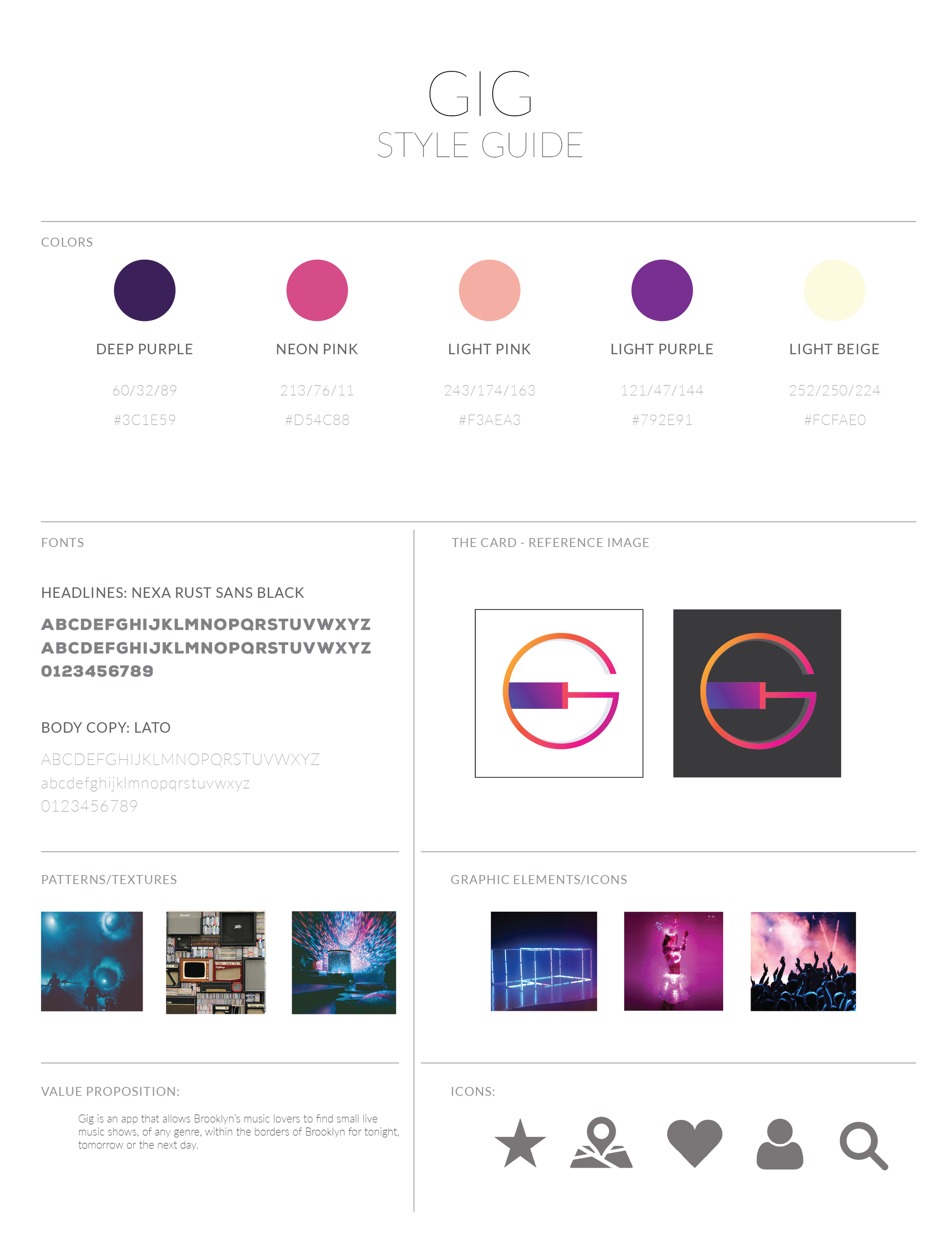
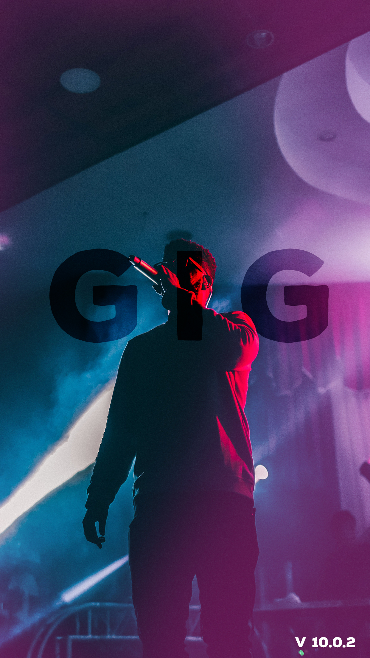
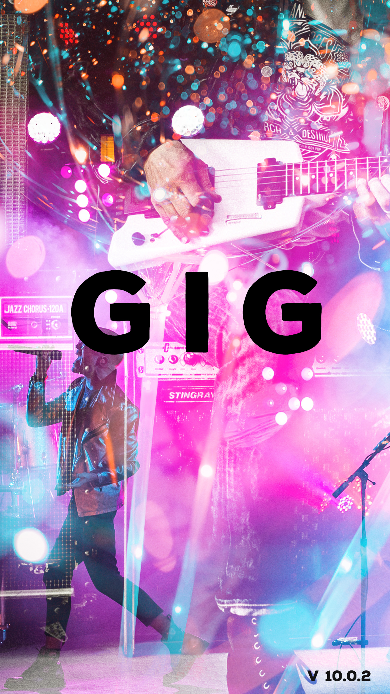
Before starting on our mid fidelity mock up, we brainstormed on a style guide for us to use. Sophia took our ideas and constructed a style guide so our designs are more cohesive. She also created some initial splash screens for us to get a better feel of the app. We went with a darker color palette to match theme of the low lit lighting around bars with some bright colors as highlights.

Mid Fidelity Mock Ups
We split the pages with each person taking about 4-5 pages to design. Using both the style guide and the low fidelity mock ups we had, we all created our own pages and put them all together in one file afterwards.
App Demo

Value Added Services
To keep users on our app, we looked to create value added services for both bands and band-seekers using this app. Adding a way to track bands, as well as give recommendations for similar bands to band-seekers gives them a value added benefit to use our app even when they are not looking for a night out. These recommendations also allows these bands to collaborate based on their similarities in music.
Afterthoughts
Our findings prove that Gig is a viable addition to the show finding market. While we share many features with our competitors, the area where Gig stands out is on the hyper local level. Most other apps focus on an area radius of 25-50 miles whereas Gig is strictly within the boundaries of Brooklyn. This allows users to walk to a show and find a new favorite venue based on proximity to their location. We can use smaller measurements, like feet, to be able to tell users how close a show is to them (if it is under a mile), while other apps have shows listed for venues as far as New Jersey or Connecticut. None of our competitors offer much in the way of user generated content, which makes sense for us as well since we’re promoting events for established artists. This would be an area to explore further to see if this functionality is something users want. The social media component found among our competitors may be something we need to include. Users expect that functionality by now and may be miffed if it isn’t available. None of our competitors offer much personalization beyond music preferences. We may want to look into whether this functionality is something users need, though it doesn’t seem so at this juncture.